INDUSTRY

Personal Finance

YEAR

2025

ROLE

UX research, concept validation, UX design, prototype testing

Designing Mindful Money Habits

Designing Mindful Money Habits

A six-week lean UX sprint to validate the concept of a spending journal called SpendLight

A six-week lean UX sprint to validate the concept of a spending journal called SpendLight

Project Snapshot

Over six weeks, I turned an early “spending journal” idea into a clear, testable iOS MVP. Research revealed that people aren’t looking for another budgeting tool. Instead, they want emotional awareness around discretionary spending, and they want to celebrate not spending as a meaningful win. I designed a friction-light journaling flow and insight model that the team is now using as the foundation for their upcoming iOS build.

Key Outcomes

  • Defined a focused MVP scope from an ambiguous starting concept

  • Validated core user motivation: emotional awareness > budgeting

  • Delivered journal flow + insight model ready for engineering handoff

  • Produced an MVP spec the team will use as the blueprint for development

A former colleague approached me to help shape SpendLight, a spending journal app he was developing with his son. As a software + data engineer, he could build the app but wanted design leadership to define the aesthetic, user experience, and core messaging of the app.

Over six weeks, I led research, concept validation, UX design, and prototype testing—translating a behavioral-science idea into a validated MVP plan ready for development.

We met weekly to review progress, co-ideate, and refine the product direction. I also designed a lightweight brand system, landing page concepts, and ad creatives to validate messaging before writing any code.

Tools: Figma (Design, Make, Buzz) • ChatGPT

Deliverables: Research insights • Prototype • MVP brief • Annotated design files

The Challenge

Traditional budgeting apps often overwhelm users with data (and guilt - you exceeded your dining out budget AGAIN). We posited that behavior change starts with awareness, not analytics - this has been proven to be true for food journaling and weight loss - does it also apply to discretionary spending habits?

Many people abandon budgeting tools because they require meticulous tracking or feel punitive. We wanted to test whether a calmer, reflection-based approach could help users spend more intentionally.

Initial hypothesis:

People who avoid budgeting apps will try a spending journal if it feels emotionally supportive (calm, awareness, self-control) and non-judgmental.

Refined hypothesis:

Writing brief reflections is the habit that matters; charts and budgets are secondary reinforcers.

The app concept my colleague had started already focused on discretionary purchases and "no-spend days"; bank linking was intentionally excluded to minimize friction and privacy risk. However, early testing he had conducted with potential users met the common refrain: "I don't want to have to input all of my transaction data!" Clearly we needed to reduce friction and make the journaling experience feel less like boring data entry.

We planned two validation stages: first, test the message (landing pages + ads); then, test the experience (interactive prototype). Due to the 6-week timeline, we ran messaging experiments and prototype testing in parallel rather than sequentially.

Process Overview

Over six weeks, I alternated between concept validation, prototype iteration, and user testing, keeping the scope lean while building toward a clear MVP.


Week

Focus

Key Activities

1–2

Concept validation

Screener survey posted to social media, early concept interviews, initial landing-page variants, start working prototype in Figma Make

3–4

Prototype ideation

Mid-fidelity designs, A/B landing-page messaging ideation & refinement, client alignment on tone

5

Testing & iteration

Two user tests of Figma Make prototype, design ad concepts

6

Synthesis & handoff

Research insights summary, MVP design brief, annotated Figma designs

Research & Discovery

Goal: Understand why people resist budgeting tools and what would make a spending journal feel usable, safe, and worth returning to.

Approach

I ran four generative, semi-structured interviews (45–60 minutes) with adults who had abandoned, avoided, or grown frustrated with budgeting apps:

  • A household manager who tracks spending for her family.

  • A small-business owner juggling personal and business expenses (mostly cash + Venmo).

  • A non-US young adult who is AI-positive but overwhelmed by day-to-day micro-spending.

  • A tech-savvy FIRE enthusiast with established tracking habits and multiple financial tools.

The interviews focused on:

  • How they currently track (or avoid tracking) day-to-day spending.

  • Past experiences with budgeting and tracking apps (what worked, what didn’t).

  • Emotional moments around money (payday, bill day, end-of-month, “treat yourself” purchases).

  • Reactions to the concept of a reflective spending journal instead of a strict budget.

In parallel, I conducted a competitive audit of:

  • Budgeting apps: Monarch, Copilot

  • Journaling apps: Day One, Daylio

  • AI financial “coach” apps: Cleo, Rosebud

I evaluated each for onboarding friction, data connections, logging flows, tone of voice, and how they handled emotional aspects of money (if at all).

Key Patterns 

Across interviews, six themes emerged regardless of age, financial habits, or comfort with money apps. These patterns helped us define what SpendLight must do (and avoid) to feel safe, simple, and emotionally supportive. The insight cards below summarize these themes; each reflects frustrations, emotional drivers, and desires that appeared consistently across participants.

These findings supported our hypothesis that awareness and reflection, not granular budgets, are the primary levers for behavior change.

Awareness Over Budgets

Users don’t want strict budgets—they want clarity and emotional calm.

Insight

Participants rejected "You have $X left" budget styles. They wanted to understand their actual patterns without being constrained or judged. Awareness felt empowering; budgeting felt stressful.

Quotes

  • “I know some people have a specific amount they can spend on food. That would stress me out.”

  • “I want to know if I’m living below my means.”

Design Implication

Prioritize awareness snapshots (totals, patterns, anomalies) over prescriptive budgets.

3–5 Inputs Max

Anything beyond a few quick fields creates friction and abandonment.

Insight 

Logging must feel effortless. A 10‑second capture flow is essential to avoid backlog guilt—one of the main reasons people quit apps.

Quotes

  • “If it feels like work, I’m not gonna do it.”

  • “Typing into Notes becomes a job I don’t want to do.”

Design Implication 

Default to amount + category + optional note. Everything else must be hidden or optional.

Money is Emotional

Anxiety, guilt, identity, and self‑care heavily shape spending behavior.

Insight 

Participants linked money to mood, self‑worth, and family roles. Emotional triggers (end‑of‑pay‑cycle anxiety, treat‑yourself guilt) disproportionately shaped financial decisions.

Quotes

  • “Money is emotional as much as it is numerical.”

  • “When it’s the last days before payday I’m like AAAAH constant anxiety.”

Design Implication

Use warm, non‑judgmental language and reflection prompts that normalize emotion.

Coaching Not Policing

Users wanted guidance on what changed and what mattered, not punishment.

Insight

People wanted context and interpretation: essentials vs impulsive, what actually shifted, and gentle encouragement. They did not want budgeting alarms or scolding.

Quotes

  • “I want an AI coach I can tell everything to, and it helps me understand what’s essential.”

  • “Just show me what changed this month.”

Design Implication 

Provide empathetic micro‑insights (e.g., "Your gift spending rose by $40—common during holidays"). No reprimands.

Privacy By Default

Users can be wary of sharing full financial data.

Insight 

Participants were comfortable logging manually but uncomfortable connecting multiple bank accounts. They didn’t want to feel surveilled.

Quotes

  • “It makes me nervous to share all that bank data with multiple apps.”

  • “I want it to feel personal, not like someone’s watching.”

Design Implication

Make bank linking optional; default to local, private entries with transparent data controls.

Money Lives in Multiple Places

Cash, Venmo, and joint cards don’t fit tidy budget categories.

Insight

Participants used mixed channels (cash, apps, personal vs business spending) which made traditional budgeting tools feel rigid or inaccurate.

Quotes

  • “There are so many different ways to spend money.”

  • “Cash change, bus fare, Venmo—none of it fits neatly somewhere.”

Design Implication 

Support flexible input types and quick tagging for mixed-source and project-based spending.

Design Principles Derived from Research

  1. Capture an entry in < 10 seconds.
    Default logging to 3–5 simple fields so it never feels like “a job” or creates backlog guilt.

  2. Reflect without judgment.
    Use language and prompts that treat emotional spending with curiosity, not blame.

  3. Keep data private by default.
    Position the journal as a personal space, not a surveillance dashboard.

  4. Support flexible depth.
    Allow users to stay high-level most days, with optional spaces for notes and deeper reflections when they have the time or emotional energy.

  5. Meet people where their money actually lives.
    Support cash, Venmo, and mixed sources instead of assuming everything flows through one bank feed.

Concept Validation: Testing the Message Before Building

Before investing in code, we tested whether the idea of a “spending journal” resonated emotionally via landing pages and ad creatives.

Goal: Identify which outcome—calm, self-awareness, or curiosity—motivates users most.
Metrics: Primary : email-signup rate · Secondary : ad CTR + scroll/CTA clicks.

Two emotional frames

Variant

Hook

Headline

Hypothesis

🌿 Find Your Calm

Emotional safety, relief from stress

“Notice your spending. Find your calm.”

Calm awareness will drive engagement.

💛 Your Spending Is a Story

Curiosity & meaning

“Your spending is a story. What does yours say?”

Self-understanding will spark curiosity.

Both positioned SpendLight as:

“A spending journal that builds awareness and calm through quick daily reflections—no budgets, no spreadsheets.”

Result

Early qualitative feedback favored Find Your Calm: it espoused mindfulness and a reflective attitude. We didn’t have enough volume for statistical confidence, but we consolidated design & testing to this single, compassionate frame, and future ad spend can further validate this messaging angle.

Impact on product direction

  • Clarified SpendLight’s positioning as a mindfulness tool, not a budgeting app.

  • Informed tone (“awareness, not control”) and onboarding language.

  • Inspired the “coach vs cop” principle for all interactions.

Ads were meant to evoke the calm of mindful journalling.

Design Evolution: Journal Concepts to Prototype

Message clarity shaped the experience: we designed a journaling flow that felt reflective, not transactional. My colleague and I compared and contrasted multiple journaling concepts and selected elements from a few that we wanted to incorporate into the MVP core journaling flow

Early Explorations

Input Mechanics
Motivation & Feedback
  • Choose ballpark amount of purchase instead of specific number.

  • Voice capture of purchase details.

  • Photo capture of receipts that are then OCR'd to populate purchase details.

    • We parked receipt photos since we converged around the app being more about big picture reflection versus detailed accounting of spending.

We explored social, plant and character metaphors for encouragement.

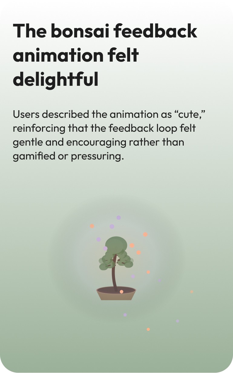
  • We landed on a plant for its ripe metaphor of growth. The bonsai serves as visual feedback and motivates daily logins.

Visual Tone

Soft peach, lavender, and sage palette · Outfit typeface for friendly tone

Key Principles

Friction-light · Reflection-rich · Coach, not cop · Calm by design · Private by default

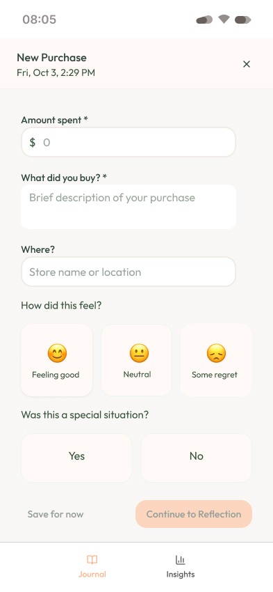
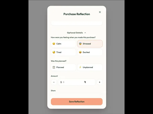
We evolved from a journal entry that revolved more on how much spent and category to focusing first on reflection and adding supplementary details about the purchase itself. In line with our hypothesis that the core utility of journalling for behavior change is in the writing itself - not in detailed accounting.

User Testing & Iteration

I conducted two moderated usability tests over Zoom using a high-fidelity Figma Make prototype. Participants represented the target use case: adults who want more awareness of their discretionary spending but dislike traditional budgeting tools. Each session ran 45–60 minutes and followed a think-aloud format.

What Worked

Pain Points → Iterations

I took the main pain points identified in the user interviews and immediately iterated on the prototype. Here three issues I acted on:

Issue

What We Observed

Design Change

CTA “Purchase Reflection” was too narrow

Users weren’t sure if reflections applied only to purchases, and didn’t know how to reflect on no-spend days or mindful choices.

Renamed CTA to “Add Reflection” and added a No-Spend Reflection path to support daily habit formation.

Reflection Focus Areas were misunderstood

Users overlooked the selector, didn’t understand how it affected prompts, and felt some focus areas overlapped.

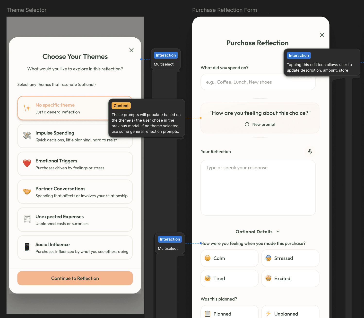
Removed the selector and introduced optional tags (e.g., Impulse, Mood, Social Influence, Partner Communication). Tags allow multiples and match users’ mental models.

Purpose of the app was unclear

Several participants assumed they needed to log all expenses (e.g., groceries, utilities). Quote: “Am I supposed to add grocery shopping? Or only discretionary stuff?”

Added onboarding that clearly states the app is for discretionary, emotional, or impulse spending—not fixed bills or necessities.


Key Insight

Testing validated the emotional and reflective approach, but surfaced an important need: the app must explain, immediately and repeatedly, that it is not a budgeting tool and not meant for logging every expense.

Clarity of intent became a core part of the onboarding and microcopy strategy.

Users resonated strongly with mindfulness and awareness, but the purpose of their spending journal must be clear.

MVP Definition & Handoff

MVP Scope

Out of Scope

Deliverables

Onboarding

  • Set expectations and allow users to set a goal for their spending behavior (spend less, improve partner communication, cut back in a certain category)

  • Reflection Flow (purchase + no-spend)

    • Optional tags for themes per journal entry

  • Mood check-in

  • Feedback

    • Bonsai growth

  • History/navigation (calendar, feed)

  • Bank linking

  • Detailed analytics

  • Social/challenge features

  • Coach modes

  • Research Insights Summary

  • MVP Design Brief v1

  • Figma Make Prototype (password-protected)

  • Annotated Figma Design files

  • Event schema → reflection_created, mood_logged, insight_viewed

Together, these artifacts gave the engineering team a clear, buildable spec—what to ship, what to track, and what to postpone.

Annotated Figma files

Reflection & Learnings

What worked

  • Using Figma Make + Buzz for fast iteration on prototype and ad concepts.

  • Leveraging AI for summarizing notes + idea generation.

  • Weekly reviews with the founder kept scope realistic and helped us make quick trade-offs as insights emerged.

What I’d do next time

  • Use AI transcription for interviews (both generative and user testing) to capture everything mentioned without detailed notetaking on my side.

  • If time allowed: 

    • Run a proper landing-page + ad CTR test to quantify which emotional frame resonated the most.

    • Test prototype with more users after refinements.

Future Directions

For users who enjoy the bonsai metaphor but want the opportunity to personalize:
  • Selectable plants tied to milestones: bonsai, cactus, rose bush — after reaching a certain number of reflections (or no spend days, depending on the user's goals)

For participants asking for education around reducing impulse buys, decluttering tips and charitable giving:
  • Mindful tips: decluttering, donation suggestions, sustainability content, proven ways to reduce impulse spending (e.g. pause before making a purchase)

For those motivated by streaks and external accountability:
  • Community challenges: shared motivation: no-spend streaks or cutting back on specific categories (decrease weekly spend on lattes)

  • Social: test sharing reflection cards without disclosing amount spent to solicit encouragement from friends/family

Let’s build something great!

Available For Work

All rights reserved, Vanessa Bell ©2025

Let’s build something great!

Available For Work

All rights reserved, Vanessa Bell ©2025

Let’s build something great!

Available For Work

All rights reserved, Vanessa Bell ©2025